OVERVIEW
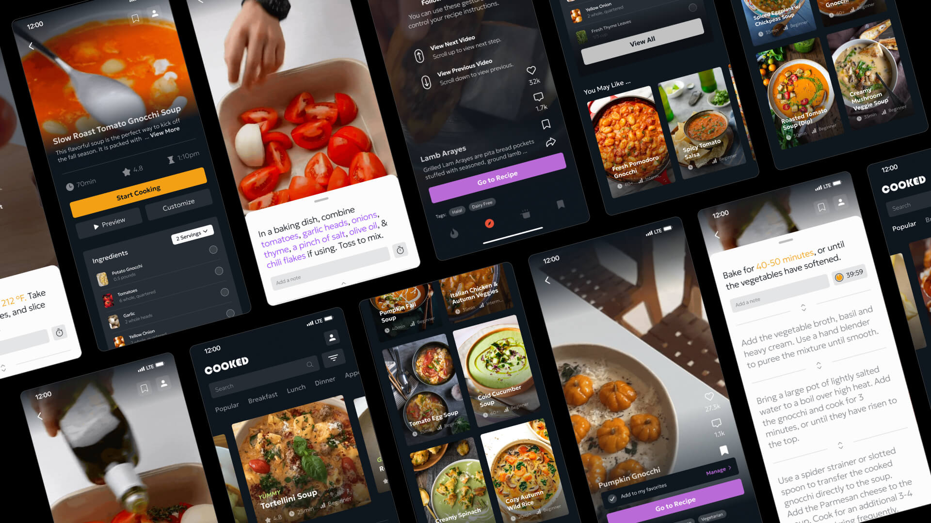
Most online recipes are packed with dense text, and let’s face it—some cooking videos can be tough to follow. That’s where the Cooked App comes in. It’s designed to make cooking easier and more enjoyable, no matter your skill level. With an intuitive, step-by-step approach, it turns the kitchen into a space where anyone can cook with confidence and efficiency.
"Good food is like music you can taste, color you can smell. There is excellence all around you. You only need to be aware to stop and savor it."
"Anyone can cook!"
- Chef Auguste Gusteau from the movie, Ratatouille

USER INTERVIEWS
The results of the interviews indicated a split between hobbyist homecooks and those who find cooking a hassle.
DISCOVERY
Current users find new recipes and discover short food content and long-form videos through multiple avenues.
Below showcases the wordmark and logo for the app Cooked. The typeface is Geological. The brand utilizes primary colors black and white, with a set of bolder saturated colors for accent cases. The example below showcases the brand identity.
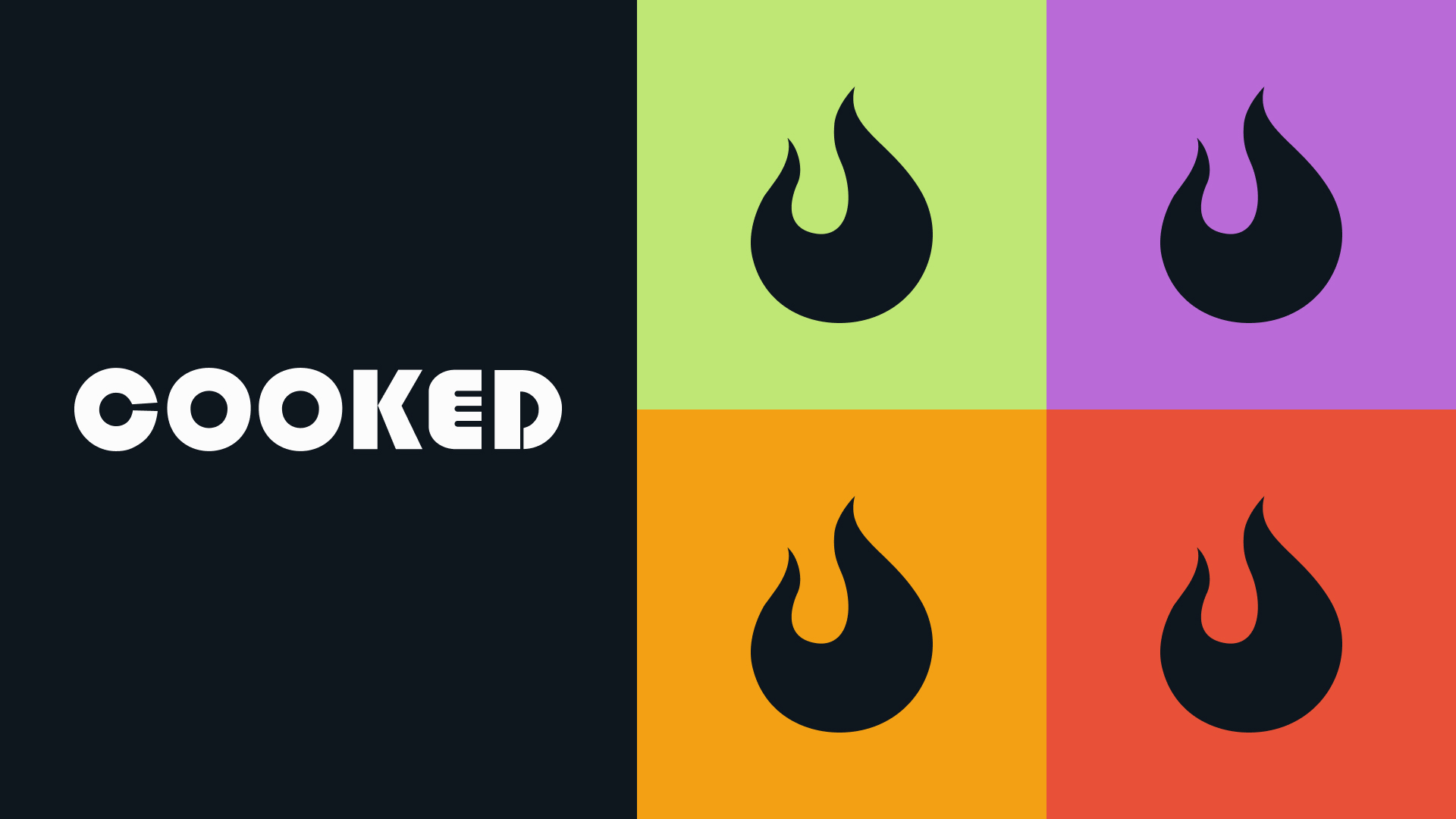
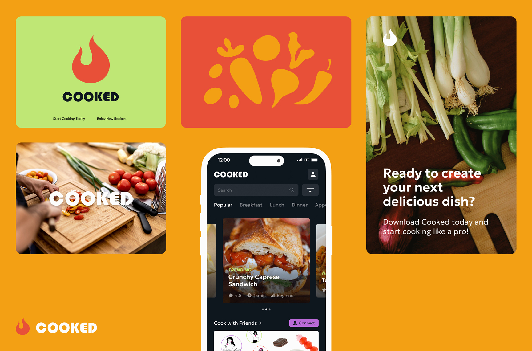
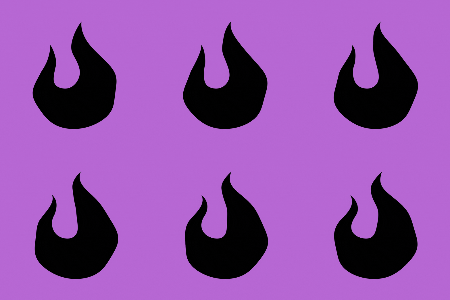
Cooked's visual icon and logo is a simplified shape inspired from fire. The fire shape is symbolic of the fuel and constant motif throughout Cooked's branding.

THINKING AHEAD
With so many cooking apps available, how can we differentiate ourselves from the existing products in the market?
Want more details?
To view the entire case study, click here.
© 2025 LUCY ZHANG
