OVERVIEW
Google Calendar is widely used by users around the world. Interestingly enough, Google’s integrated platform task feature is not as commonly used. Users struggle with a text-heavy and disorganized workspace in its current state.

PROJECT GOAL
For this Add A Feature Capstone, the idea was to find ways to visually organize and improve the task section of Google Calendar.
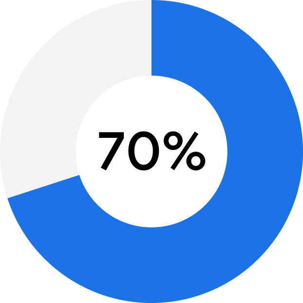
Current users find new recipes and discover short food content and long-form videos through multiple avenues.
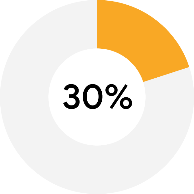
1 out of 5 participants reported using a product for only quick or small tasks.
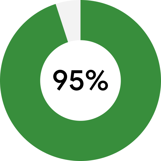
Almost all participants said they never used Google Calendar Tasks before.
01
Strong emphasis on order and organization
Users had a strong interest in rearranging and organizing their task lists based on order of importance and priority.
02
Visual Hierarchy & Color Separation
Participants reacted positively to task managements tools with better user interface design as many are “visually motivated” to complete tasks.
03
Overwhelmed by text-heavy workspace
When shown with the current Google Calendar Task interface, participants expressed feeling “overwhelmed” by the current product.
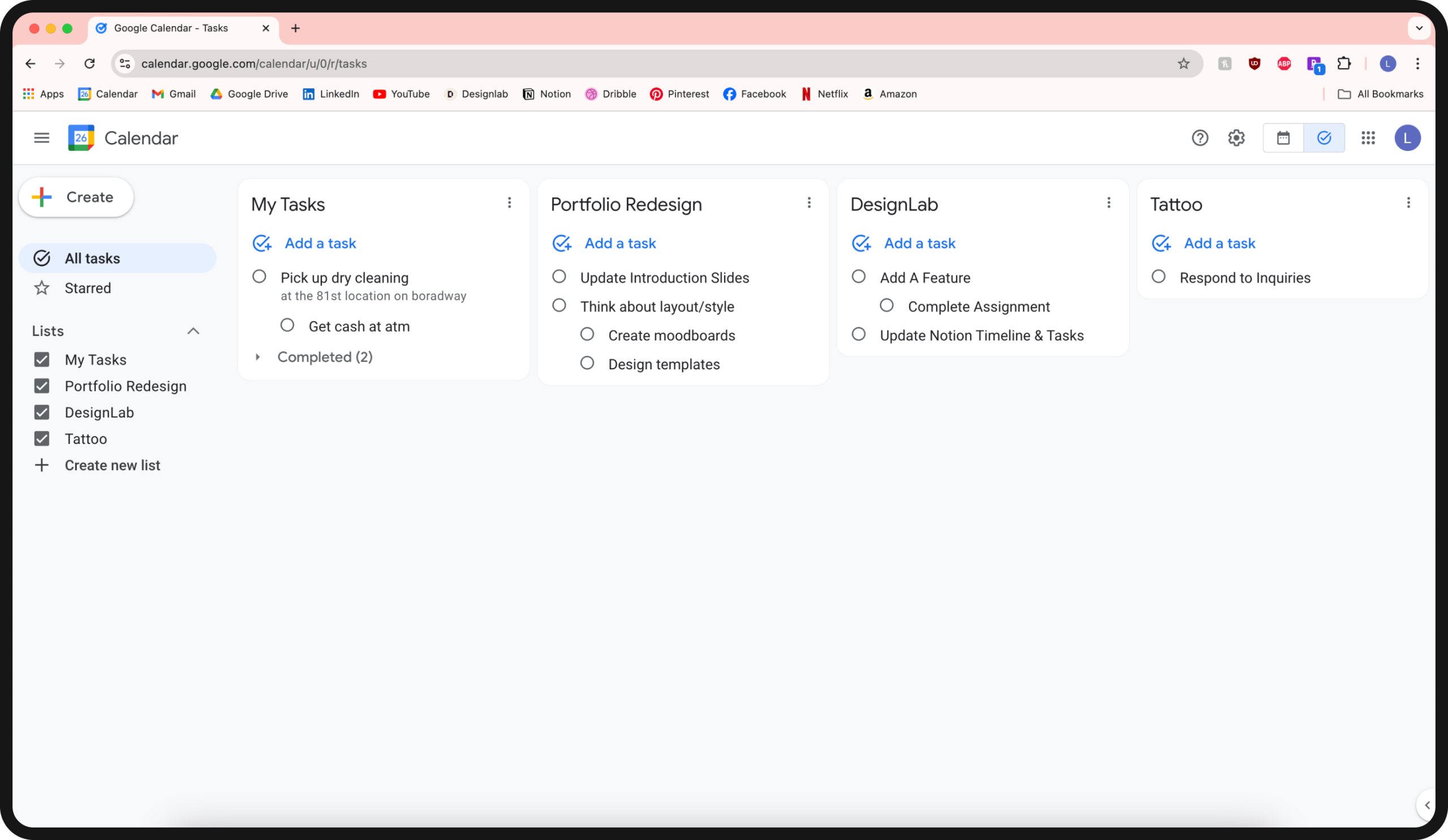
This is the current Google Task desktop interface. Users expressed feeling unmotivated as it is difficult to visually organize tasks. There is a lack of visual hierarchy and the platform has an absence of features that other productivity tools provide.
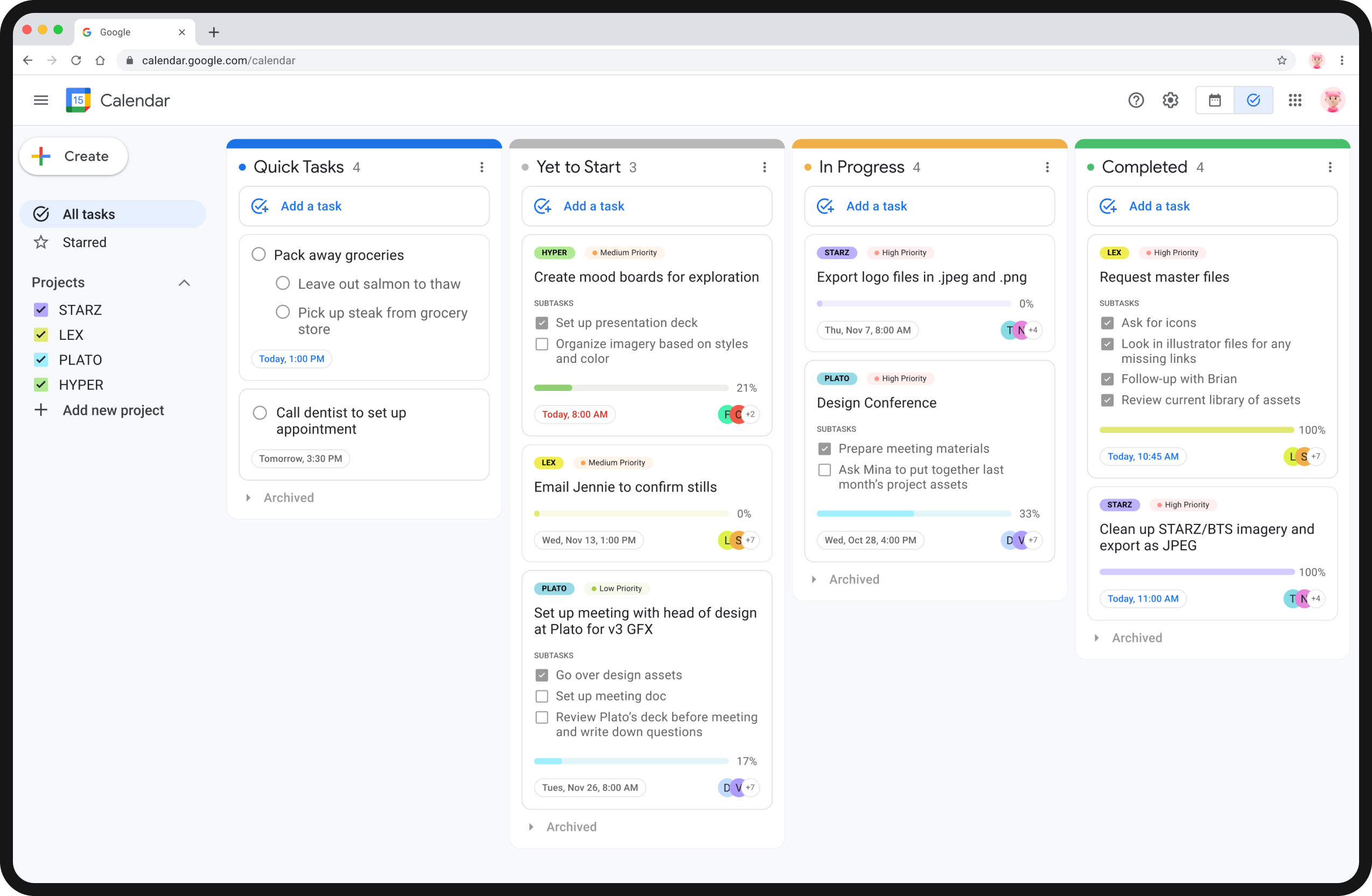
The new redesign of Google Task offers better categorization, organizing task lists and projects into different states. Team collaboration and timeline tracking are also new features added to the desktop.
NEW OPPORTUNITY
For this Add-A-Feature Capstone Project, the objective was to reimagine and enhance Google Tasks by focusing on a more intuitive and visually organized design for the desktop platform.
View full project?
To view full case study, click here.
© 2025 LUCY ZHANG
